#webdesign
#landingpage
#framer

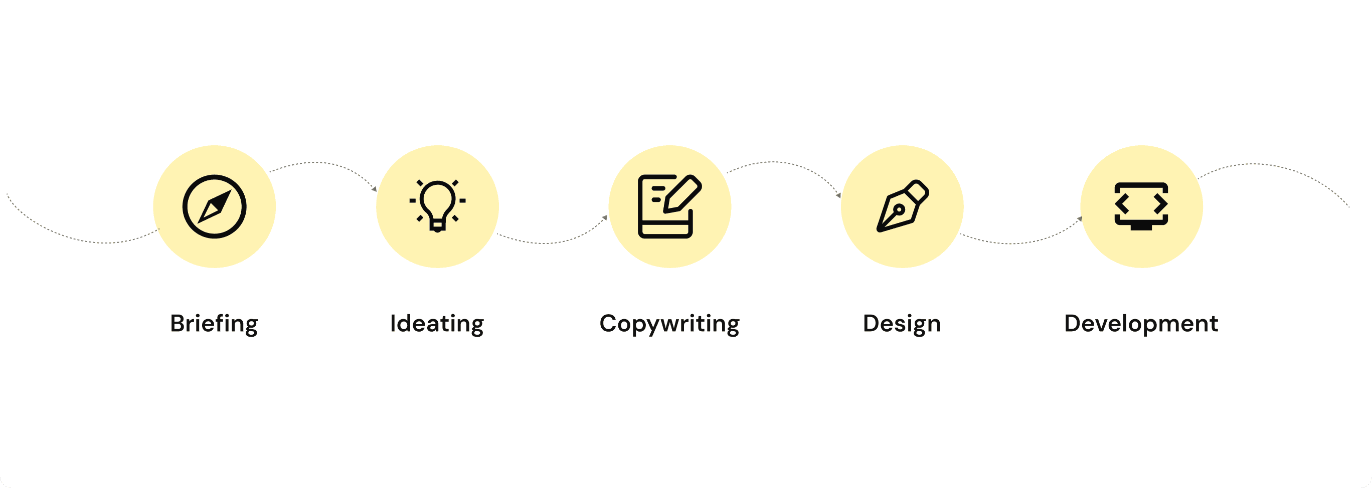
To ensure a seamless and strategic creation of the landing page, I followed a structured end-to-end workflow represented in the visual above. Each stage played a key role in aligning business goals, user needs, and the final functional delivery:
1. Briefing
The project began with a detailed briefing to understand the product, target audience, core value proposition, and expected outcomes. This foundation guided all subsequent decisions.
2. Ideating
Based on the insights gathered, I explored possible solutions through brainstorming sessions, sketching early concepts, and mapping different user flows. This stage focused on identifying the most intuitive and impactful approach.
3. Copywriting
With the structure defined, I crafted concise and persuasive messaging aligned with the brand voice. The goal was to ensure clarity, highlight key benefits, and support users’ decision-making process throughout the page.
4. Design
I translated the strategic direction and content into a high-fidelity visual language. This included layout composition, visual hierarchy, color usage, typography, and UI components—always prioritizing usability and aesthetic consistency.
5. Development
Finally, the approved design was implemented in code, ensuring responsiveness, performance, accessibility, and pixel-perfect accuracy. The landing page was optimized to load quickly and provide a smooth experience across devices.
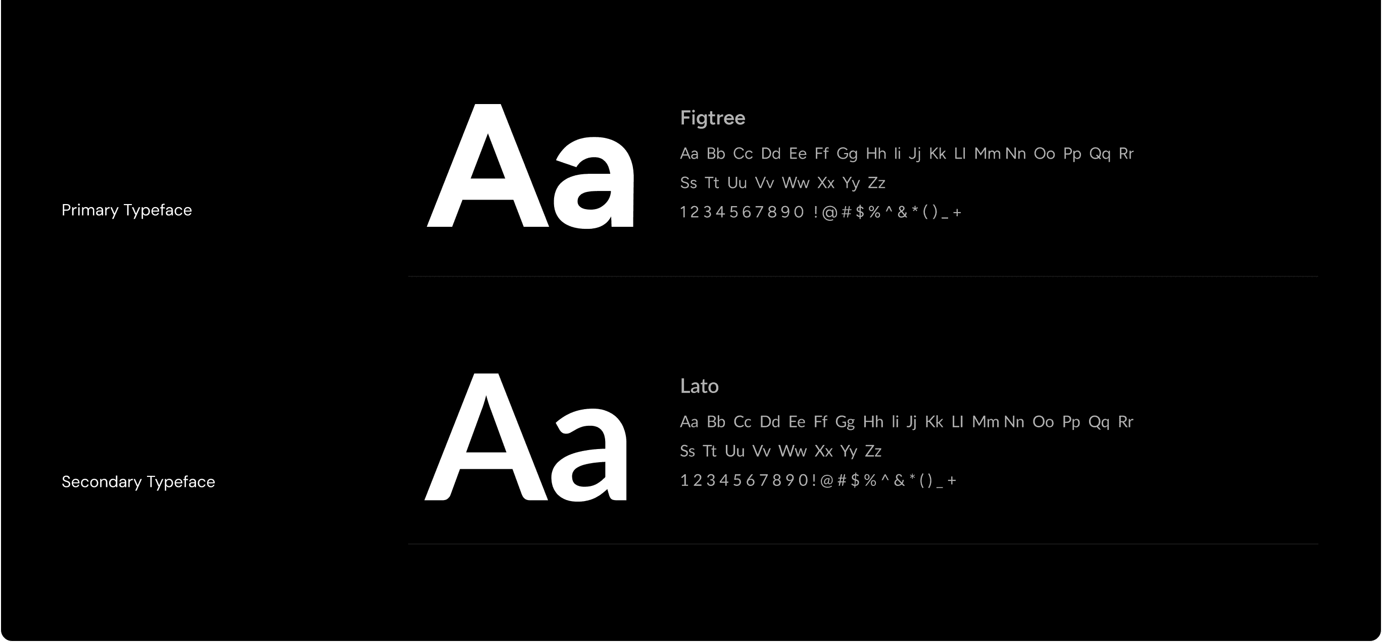
For this project, the typographic system was crafted to balance clarity, modernity, and readability across all touchpoints of the landing page. The combination of a strong primary typeface with a versatile secondary typeface ensures both visual hierarchy and functional accessibility.
Primary Typeface — Figtree
Figtree was chosen as the main display and heading typeface due to its clean geometric structure and contemporary aesthetic. Its bold presence enhances scannability, making key messages and section titles immediately noticeable. The font’s rounded details contribute to a friendly and accessible tone, aligning with the project’s goal of creating a welcoming digital experience.
Secondary Typeface — Lato
Lato complements Figtree by serving as a highly readable option for longer text blocks, microcopy, and supporting content. Its humanist design provides warmth and balance, ensuring comfortable reading across devices and screen sizes. Lato’s versatility in weight and spacing makes it ideal for maintaining consistency throughout the interface.
Together, these two typefaces establish a harmonious visual rhythm—supporting both expressive headings and smooth, uninterrupted content consumption.
The color system was designed to create a bold, energetic visual identity while ensuring clarity, accessibility, and strong visual hierarchy throughout the landing page experience. The palette balances high contrast with warm accent tones, supporting both functional usability and brand personality.
Primary – 1 (#000000)
Black serves as the main anchor color, providing structure, depth, and strong contrast for key elements. It reinforces a sense of sophistication while helping important components stand out with clarity.
Secondary – 1 (#FFD700)
This vibrant yellow introduces energy and immediacy to the interface. Used strategically for highlights and interactive elements, it draws attention to calls to action and essential content without overwhelming the layout.
Primary – 2 (#0D0D0D)
A softer black tone complements the primary shade, allowing for layered visual hierarchy. It supports backgrounds, cards, and sections where a more subtle, modern look is required.
Secondary – 2 (#FFB325)
This warm orange variation brings balance to the palette, enriching the brand expression with a friendlier and more approachable feel. It pairs well with the primary tones, offering flexibility across different UI components.
Text (#FFFFFF)
White ensures optimal readability against the dark primary backgrounds. Its high contrast allows for clean, accessible typography, supporting users across all devices and lighting conditions.
Overall, this palette creates a dynamic yet cohesive visual experience—mixing expressive accent colors with reliable neutral tones to enhance usability, brand recognition, and visual impact.


Framer
Figma

